As a professional artist and sculptor, I’m often complimented on my compositions and how I plan my oil paintings. As we all know, there are a number of elements that make a painting successful including colour, tone, and the size and format of the surface material. However, before addressing any of these factors, the correct composition must be established. If the composition doesn’t work, no amount of artistic flair or colour scheme will come to the rescue.
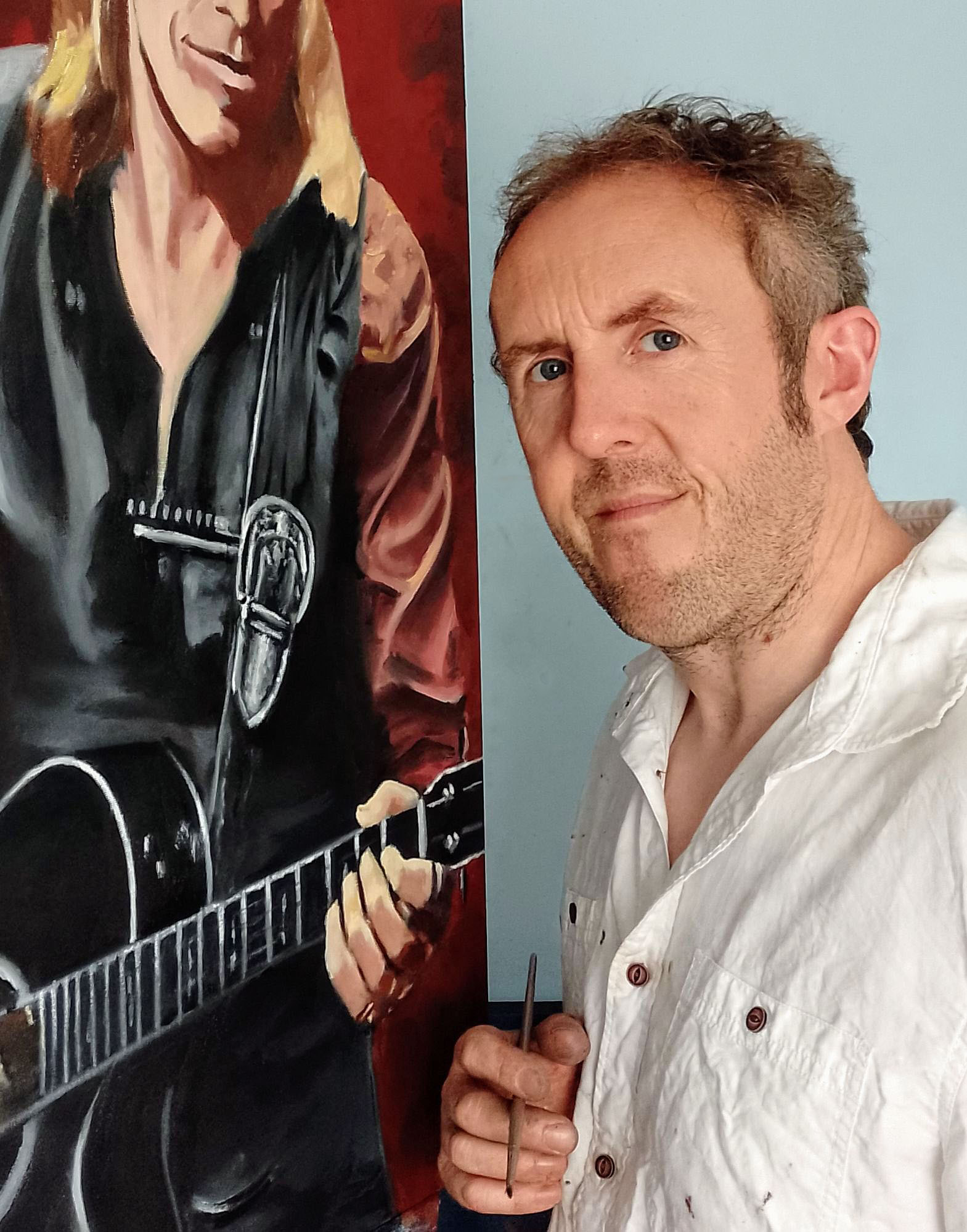
This article is based on a recent commission project for a collector in Europe, explaining how I chose the composition and what I intend to portray in the final image.
Where Do You Start
So, where does one start when planning a good composition? In a nutshell, it largely depends on what you intend to depict. A painting must be harmonious to the eye in order for it to be successful. If there’s too much going on, the viewer will feel confused. Too simple and it can appear boring. A good composition doesn’t have to be complex to work, it simply needs to communicate to the viewer what you want them to feel, and to highlight the relevant areas of interest.
If working on a commission subject, the primary aim when planning the composition is the focus of the image. If I’m working on a portrait or a particular individual, the viewer wants to see the character first, not the instrument, or what’s in the background. Sure, there can be lots of detail within the painting, provided the focal point is the centre of attention. Planning at this stage is critically important… a good painting will lead the eye around the canvas naturally, even if there’s only two or three points of interest.
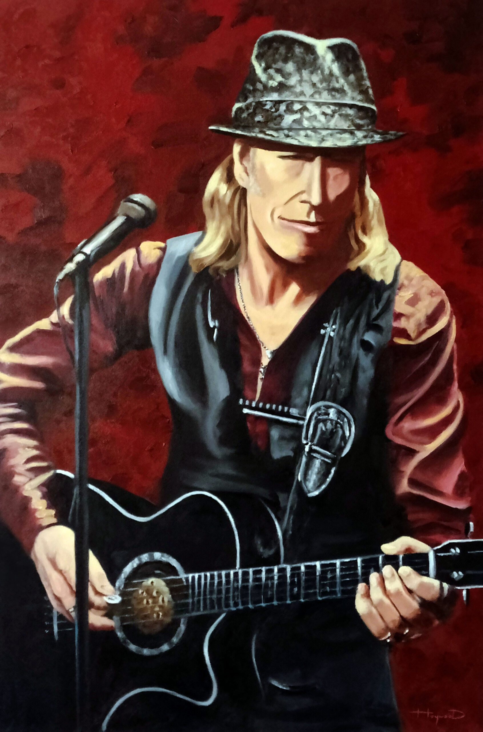
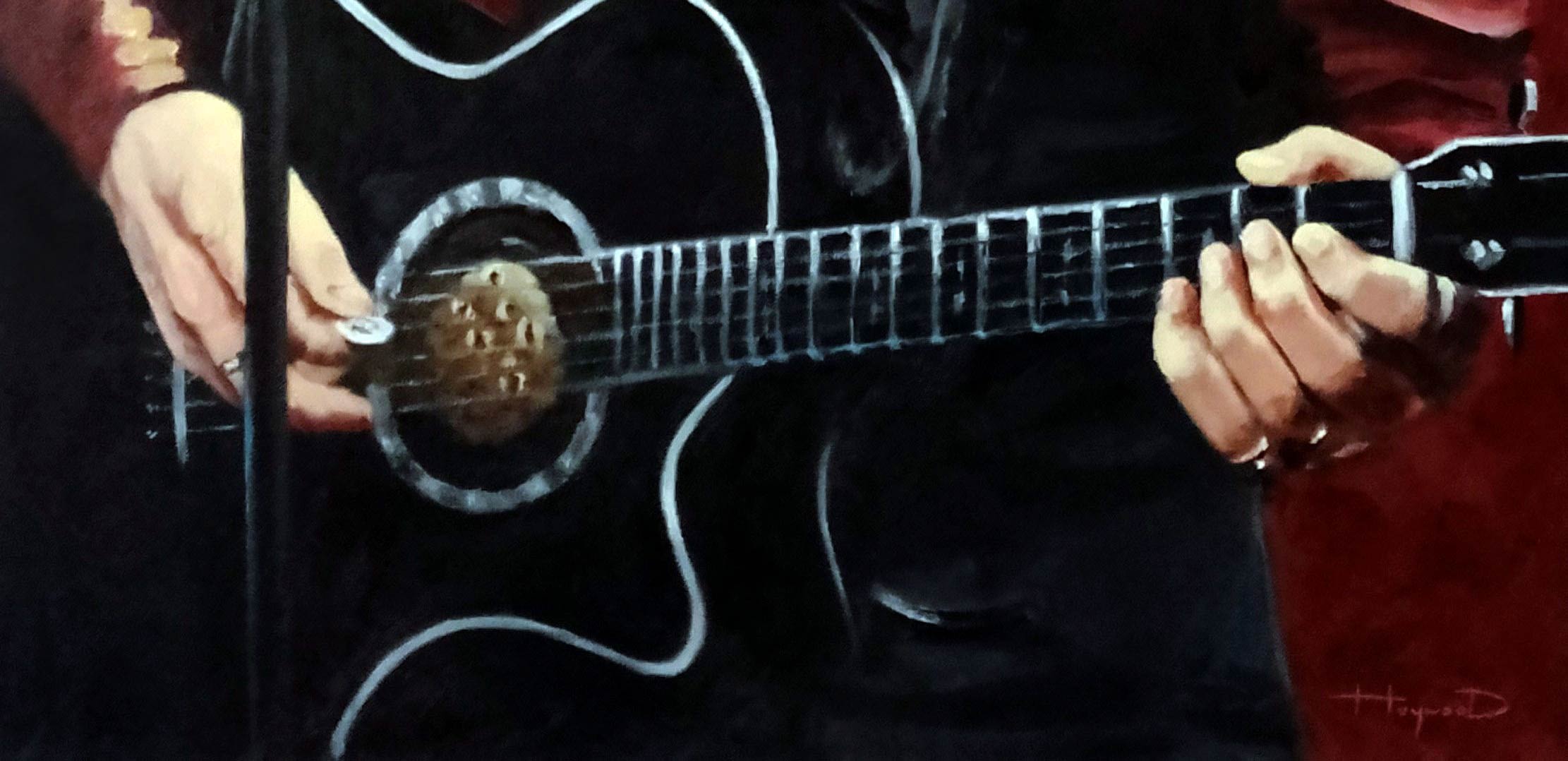
As this project is primarily a portrait, I naturally want the focus of the image to be the character’s face. Secondary to this I want to say something about the artist, such as his attire and his instrument.
I selected to portray the character’s torso slightly below the level of the waistline, which will make a nice format and complement the shape of the canvas my client wanted for his home. After studying the artist’s attire, the next step for me was to consider the secondary elements which would add further interest to the painting. In this case, a large part of the lower section of the canvas would be consumed by the guitar. The musician in question often wears a very prominent metallic guitar buckle fitted to the strap. Emphasis in this area would lead the eye straight from the head down to the guitar. The hands would then add further interest to the lower section of the canvas. I then want the viewer’s eye to work its way back up the image and return to the focal point – the face. The stand and mic will carry out this task perfectly, with the angle of the microphone directing the viewer’s eye back toward the head. Care needs to be taken here – if too much interest were included on the waist coat, then the eye would potentially rest here and wander around aimlessly. I then chose to depict the singer wearing his popular snakeskin hat. This would add further interest to the top of the image, but without compromising the focal point of the face.
The elements of interest included in this piece are balanced – enough to maintain interest but not so many that the viewer feels lost. For anyone struggling with composition my advice would be to carry out a small sketch to see if it works. It doesn’t need to be detailed, just blocking in the shapes with a brief pencil study will often prove whether or not it will work successfully.
I hope this short article has been of use and you take something from it.
An article by Mark Robert Haywood
Discover more of Mark Robert Haywoods artwork